We Tested 3 AI UI Design Tools. None Gave Us a Screen We’d Ship.

Muhammad Umer
Author
TL;DR
- Claude Design had the clearest UX and the only clean accessibility scan, but no tokens or mobile layout.
- Figma Make was the only tool with a mobile layout, but it hard-coded 44 colors.
- Stitch was the only tool with real design tokens, but its billing math doesn’t add up and it breaks on phones.
- No tool designed a failed payment, empty, loading or error state. That’s still a designer’s job.
On November 3, 2026, we gave three AI UI design tools the same two-sentence brief: design the billing and plan settings screen for a B2B project management SaaS. Figma Make, Google Stitch and Claude Design each got one shot, with no follow-up prompts.
Each first result took 8 to 12 minutes. Two were usable starting points. One needed its layout redone. None was ready for a developer.
A billing screen is where a SaaS company collects its money, so it’s a fair test of how AI output handles real failures.
The short answer: AI UI design tools can produce a usable first draft of a product screen in about 10 minutes. In our test, none of them produced a billing screen that was ready to ship. None designed the failed payment, empty, loading or error states a real product needs. A designer still has to make those calls before development starts.
Why we tested AI design on a real product problem
We ran this test because founders keep asking whether AI can design their product for them, and we’ve already rebuilt a product that was made that way. A client brought us an MVP that had been vibe coded. The basic product worked. It couldn’t grow without breaking.
The symptoms were specific. Users signed up and never activated. Every new feature made the app harder to use. Developers were building screens nobody had designed, and with no design system, those screens drifted apart with every release. We’ll come back to how we fixed it.
We design every screen in Figma before we build it, and we use AI inside that process. The question was narrow: how close does a first AI draft get to something we’d hand a developer?
How we tested Figma Make, Google Stitch and Claude Design
We gave Figma Make, Google Stitch and Claude Design the same brief on the same day, used the first result from each tool, and scored it against seven checks: speed, design tokens, states, accessibility, mobile, reusable components and what we’d fix before development.
This was the brief, word for word:
Design the billing and plan settings screen for a B2B project management SaaS. Users can see their current plan, change plan, update their payment method and download past invoices.
We kept the brief short on purpose. These tools do better with more detail and direction, but a short prompt is how most founders will try them first.
All three tools export code, so we checked each export for tokens, components and states, and ran an automated WCAG 2.1 AA accessibility scan on each rendered page. Our accessibility notes combine that scan with a designer’s review.
What each AI UI design tool produced
Claude Design and Figma Make produced base designs we could take forward with work. Stitch’s layout needs redoing, but its tokens are worth keeping. Only Stitch generated design tokens, and none of the three designed failed payment, empty, loading or error states. Every tool stopped at the happy path.
| Figma Make | Google Stitch | Claude Design | |
|---|---|---|---|
| Plan used | Professional | Free | Pro |
| Time to first result | 10 to 12 min | 8 to 9 min | 10 to 12 min |
| Design tokens | None, 44 hard-coded colors | Full token set, used for every color | None, hard-coded inline (one accent color setting) |
| Reusable components | One icon component, the rest in a single file | None | Rows built from data, no reusable components |
| States designed | Hover, focus, “Paid” badge, plan and payment modals, success message | Hover, focus, “Paid” badge, pagination | Hover, “Paid”, “Refunded” and “Failed” badges, seat limit warning, plan and payment modals, success message |
| Failed payment, empty, loading, error | None | None | None |
| Mobile | Generated, a few layout issues | Breaks at phone width | No mobile design |
| Accessibility scan (WCAG 2.1 AA) | 15 low-contrast text elements | No page title, 3 unlabeled fields, 11 fake links | No failures |
| Verdict | Usable base, not final | Redo the layout, keep the tokens | Usable base, closest to shippable |
Claude Design: the clearest UX
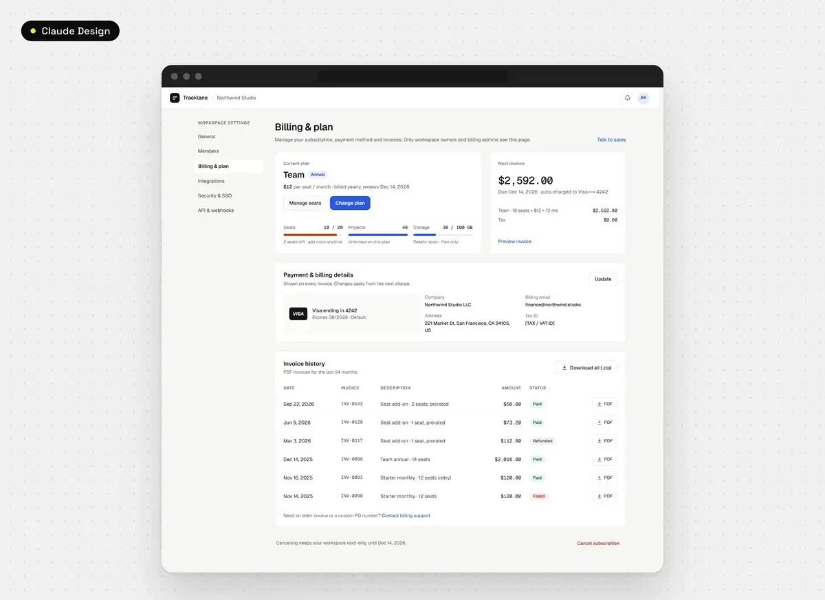
Claude Design gave us the cleanest layout and the clearest UX of the three. A user knows what to do on this page at first glance. It also covered details the brief didn’t ask for: the invoice math checks out (18 seats at $12 a month for 12 months is $2,592), and the seat bar turns orange at 18 of 20.
It’s the only tool that designed more than one invoice status, and the only one to pass the accessibility scan with no failures. Every color, size and spacing value is still hard-coded inline.
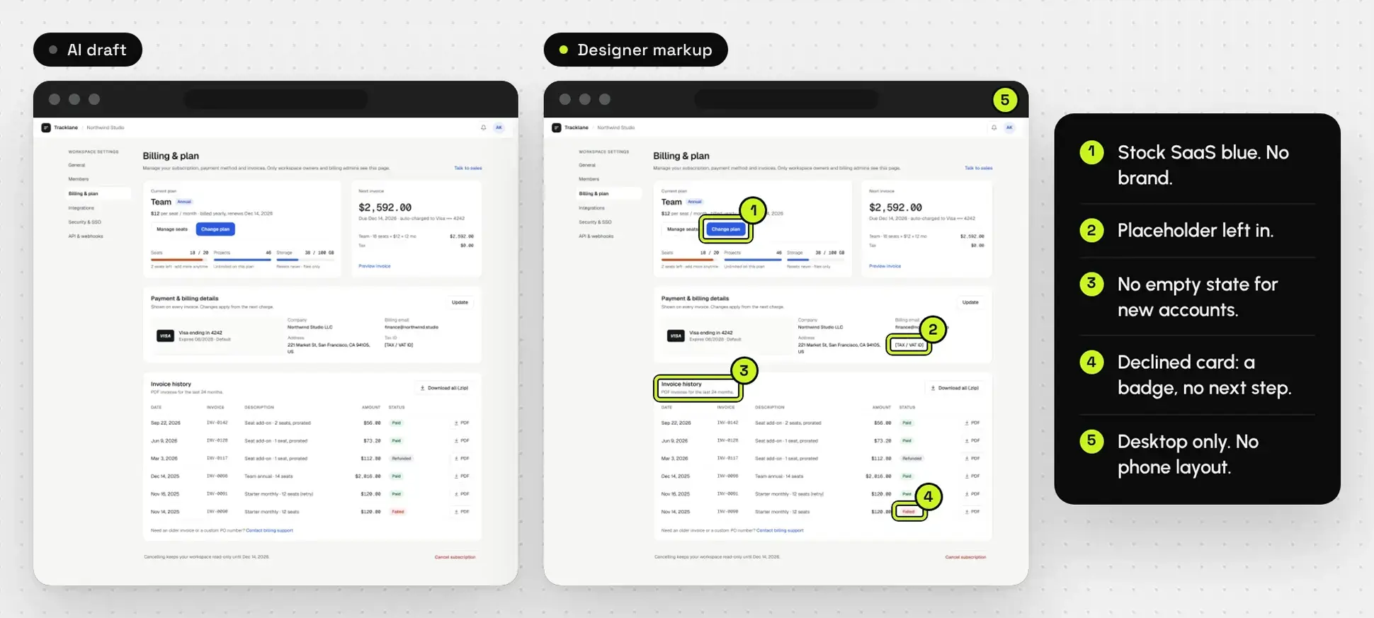
What held it back: it looks like something anyone could generate, in the basic colors most apps use, with no creative direction. It produced no mobile layout. We didn’t ask for one, but a product screen should handle phone width without being told. And that “Failed” badge is the only sign a payment can fail. There’s no banner telling a customer their card was declined, and no screen for what happens next.
Figma Make: a good base, not a final
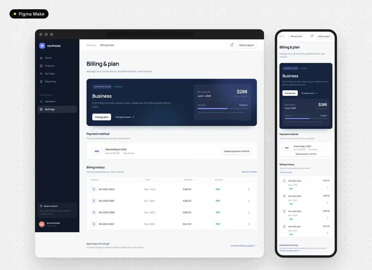
Figma Make produced the most polished visual hierarchy, with a dark plan card that pulls the eye to the current plan. It generated a mobile layout without being asked, and that layout mostly holds up. The output can also be converted into an editable Figma design, which matters to a studio that designs in Figma first.
Past the first glance, the design is generic and the colors need refining. The code hard-codes 44 colors, including 16 slightly different purple-blues, and the only reusable component is an icon. The plan picker and payment form work, but only on the happy path: there’s no error if a card is rejected, and the invoice download saves a text file, not a PDF.
The code includes focus outlines, but the accessibility scan flagged 15 text elements below the minimum contrast ratio. Most are small helper text: the note on the dark plan card sits at 2.76:1 and the table headers at 2.53:1, against a required 4.5:1. Invoice downloads are icons with no visible label. On mobile, the “Update payment method” button crowds the card details above it.
Google Stitch: the best tokens, the weakest screen
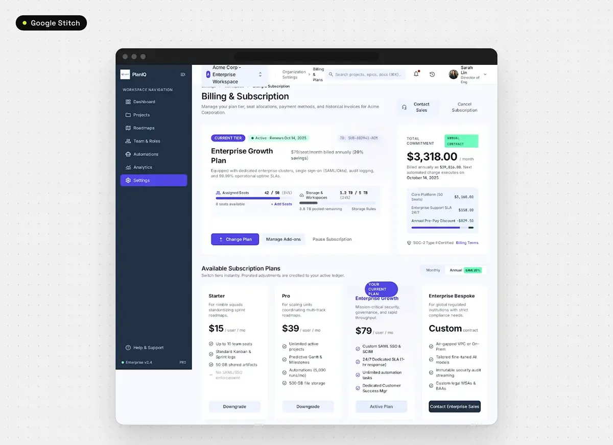
Stitch was the fastest at 8 to 9 minutes, and it’s the only tool that produced real design tokens. Its export includes a full design system file, and the page uses those tokens for every color.
The screen itself fell apart. The billing breakdown doesn’t add up: the line items total $2,488.50 against a $3,318 monthly figure, and the core platform line says 50 seats while the page shows 42 assigned. The accessibility scan found no page title, three unlabeled fields and 11 fake links, and a screen reader announces the invoice icons as “download” and “receipt_long”.
Its own design file describes a mobile layout, but at phone width the sidebar never collapses and the content squeezes into a sliver. We’d redo the layout and keep the tokens.
If your product was built fast and its screens are drifting apart, a discovery call will tell you whether we’re the right studio for the rebuild.
What AI-generated UI still misses
AI-generated UI misses the decisions that make a screen work in production. In our test, every tool skipped failure states, and two of the three hard-coded their values instead of using design tokens. Those gaps decide whether a developer can build a screen once and reuse it, or has to rebuild it every time.
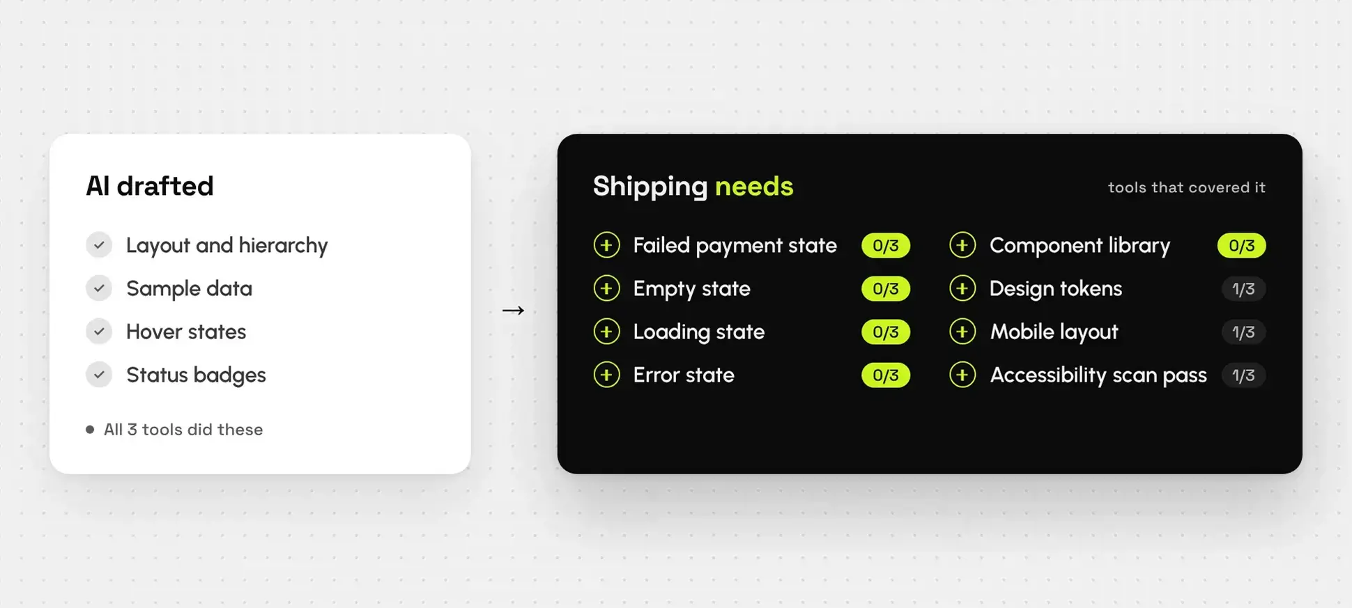
States. A billing screen gets hit by declined cards and new accounts with no invoices yet. For failures, status badges were as far as any tool went. None designed a failed payment banner, an empty invoice history, a loading state or an error after a card update. Every missing state is one a developer will invent on the spot. That’s how our client ended up with screens nobody designed.
Design tokens and components. Figma Make and Claude Design both hard-coded colors, spacing and type. UX Planet made the same argument after testing Figma’s agent: it produces generic designs with raw values instead of design tokens. Without tokens and components, a brand color change means hunting through every screen, and screens drift. Stitch was the exception: it shipped a full token set and still produced the weakest screen of the three.
Accessibility. Accessibility was the one area where an AI tool came out clean. Claude Design passed the automated WCAG 2.1 AA scan with no failures. Figma Make failed on contrast, and Stitch on labels and page structure. A scan only catches part of the problem, so keyboard flow and screen reader behavior still need a person to test them.
Can AI UI design tools replace a UI/UX designer for SaaS?
AI UI design tools can’t replace a UI/UX designer for SaaS products that customers pay through. They can draft screens and speed up early UX work. The foundation of a product, meaning its design system, its components and how it behaves when something fails, still needs a designer’s decisions. Once that foundation exists, AI becomes far more useful.
That’s where we draw the line. We don’t use AI to build the core foundation of a product, dashboard, website or app. AI gives you a quick design system that helps at certain stages, but it doesn’t hold up when the system has to scale. Once the foundation is designed and tested, we hand AI specific tasks, because by then it has the context.
We followed that order on the vibe-coded MVP from earlier. We did the branding first, without AI. Then we mapped the wireframes and user flow and settled the UX before visual design began. We designed the screens, moved into development, kept the functionality that already worked, and built a component library around it. The product launched on that foundation, with one design system and components the team can keep building on.
AI does save us time early on. It’s good at drawing wireframes and complete flows, and at turning those into first screens we refine.
There’s an honest trade-off. If you need a quick prototype to test an idea with a few users, one of these tools may be enough, and you probably don’t need a studio yet. If paying customers will use the screen, you need the foundation first. That’s where our website design and custom web development work starts. A screen that looks finished can still fail its users, for the same reason a good-looking website still doesn’t convert without strategy.
The tools will improve. Figma announced its agent, Code Layers and Motion at Config 2026 in June, and we’ll keep designing in Figma.
If you’re weighing an AI-built product against a designed one, a discovery call will tell you quickly whether we’re a fit.
Frequently asked questions
In our test, Claude Design and Figma Make produced usable base designs. Google Stitch produced the weakest screen but the only real design tokens. None produced a screen ready for development.
Not in our test. All three tools skipped failed payment, empty, loading and error states, and two of the three used hard-coded values instead of design tokens. A developer would have to invent the missing decisions.
If paying customers will use the product, yes, at least for the foundation: the design system, the components and the failure states. For a quick prototype to test an idea, an AI tool may be enough on its own.
When you’re ready to talk it through, book a discovery call.